We may earn money or products from the companies mentioned in this post.
Before I start what may very well turn into a way-too-long review of 5th Edition Dungeons & Dragons, I’m honor-bound to mention that Hex Games released the third PDF in our American Artifacts series (cleverly titled American Artifacts 3) earlier this week. For those not familiar with the series, each American Artifacts PDF collects 20 magical items from American history, folklore, and pop culture. Each entry describes the item, its history, and its abilities, then provides QAGS rules for the crunchy bits. Previous artifacts have included Stagger Lee’s hat, Gary Gygax’s dice, Ben Franklin’s robot, and Geronimo’s skull. In the latest edition you’ll find things like the original Bowie Knife, Teddy Roosevelt’s big (moose-summoning) stick, and the (magically reconstructed) guitar that Jimi Hendrix burned in that poster that hung in your college dorm room. Although written for QAGS and geared toward the Hex Ficton (The world of Hobomancer and many other Hex titles), the items can easily work in any game setting with an America.
Last week’s post provided a pretty good summary of my experience with D&D up until 3rd edition: played the hell out of it from 4th grade through high school, started discovering other games (or more accurately, people willing to play other games) but still played regularly in college, and stopped playing sometime in the mid-90s. I read 3rd Edition out of curiosity and was pleasantly surprised, but never got around to playing it unless you count a very brief Pathfinder campaign a few years ago. Outside of a demo game that my friend Stacy ran, I pretty much missed 4th Edition entirely. I planned to do the same with 5E because I still can’t wrap my head around a $50 rulebook (I am old), but found it on sale and decided to take a look.
Now, let’s talk about cover art. American Artifacts 3 has a beautiful piece of cover art (by Jeffrey Johnson) featuring Teddy Roosevelt scaring off The Devil by summoning a giant spirit moose. I love that cover more than life itself, but I could say that about all three covers in the series (the first was The Devil making his deal with Robert Johnson, the second featured sword-wielding, time-travelling William Faulkner squaring off against Old Scratch). As I mentioned in the 3rd Edition review I posted last week, I was less-than-impressed by the cover art on that one, so let’s take a stroll down memory lane and right into the modern era of D&D.
Let’s start off with the one that I saved my $1 a week allowance up for 13 excruciating weeks ($12 + 60 cents tax) to buy when I was just a wee lad:

Oh, yeah. Erol motherfuckin’ Otus. At first Otus’s work seems kind of weird-looking, but the more of it you see the more you realize that it’s not weird-looking because he’s not a good artist, it’s weird looking because it’s very uniquely stylized. Just look at this cover: we’ve got a wizard and a warrior, they’re in a dungeon, and they’re fighting a dragon. It literally reinforces the title of the game and makes it look exciting as hell. It’s got everything you need.
When I found out that Advanced D&D let dwarves have classes instead of just being dwarves (I mean, dwarfing is fun and all, but dwarfing AND fighting sounded like a riot), I got myself a copy of the Player’s Handbook (second-hand from a kid at school, if memory serves). It looked like this:
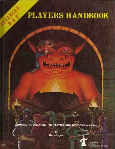
The cover art for this one is by David A Trampier. The dead thing *could* be a dragon, but if so it’s a pretty puny one. Those of us advanced enough for this book know that dragons aren’t something you fight everyday, though, so leaving dragons off of the cover gives us a more representative view of play for us more mature players (6th-graders). We’re still in a dungeon, and we’ve got all the main character classes represented, with my favorite class, the Thief, getting a bit of spotlight. Though Trampier had no way of knowing it, the gemstone-eyball stealing would soon gain extra cool points when Indiana Jones made his debut. This one isn’t as polished as some of the other covers, but it’s a classic that gets the job done.
Since I’d dutifully ripped my old Basic rulebooks up and compiled them in a binder with appropriate sections from the other rulebooks using those convenient pre-punched holes, I picked up the new version of the Basic Set when it came out. I doubt Gygax intended the whole “here are some holes to make things easier” feature as a way of guaranteeing that a lot of people would end up buying the books twice, but it worked on me. Most of you know that it had this cover:
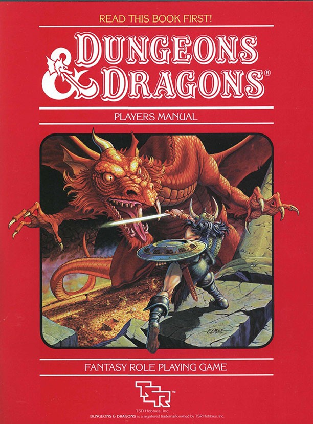
Larry Elmore was part of a group of artists that took D&D’s art game to a whole new level. This is clean, professional stuff like you’d see on the cover of a novel from a major publisher. The cover here only hints at the dungeon, but the dragon about to either kill or be killed by his Warduke-esque opponent is front and center. The layout, with the hero’s leg and the dragon’s claws breaking the frame, makes an already exciting piece of art even more dynamic. Otus is kind of posed and Trampier’s cover is mostly static, but in Elmore’s cover there’s shit happening, which makes the game seem fun and exciting. I may be biased because Elmore is a fellow Kentuckian and genuinely nice guy (he hung out for a couple of beers with us after he did a signing at the store where I used to work and we’ve crossed paths at lots of cons), but for me this is the gold standard in D&D covers.
Through the inevitable swapping and bequeathing of books that happens in any gaming group, I also eventually ended up with the second cover of the First Edition Player’s Handbook:
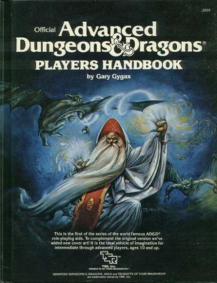
This one’s another Kentucky boy, Jeff Easley (who sadly I’ve only met once, and just long enough to get a couple of books signed–including this one, I believe). Easley’s work has the crispness of Elmore and company, but has kind of a retro fantasy art feel thanks hazy, misty, or in this case magic glowy backgrounds reminiscent of Frank Frazetta’s stuff. No dungeon or dragon here, but this wizard pretty much screams “Why don’t you sit back and pour your self a big goddman mug of MAGIC?” Like the Elmore cover, it’s also very active and makes it feel like cool stuff has to happen in this game.
Of course in 10th grade I bought the 2nd Edition Player’s Handbook the second it came out. Google’s not giving me any decent-sized cover pics, so here’s the art without the words:
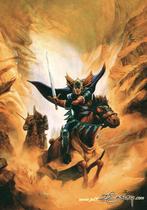
Another one by Easley, this one is both dungeon and dragon free and has what my high school art teacher would call “ice cream mountains.” While the color scheme is a little muted (we’lll get to that soon), the strong contrasting colors make the central figure stand out and the artwork is action-oriented enough that it screams “ADVENTURE!” It’s not as strong as some of the previous covers, but it’s a solid entry.
There was a second 2E cover (A barbarian breaking some shit, I think) but most of my thoughts about it are similar to my complaints about the new edition. As I mentioned in my review, the 3E cover made the game look arcane, complex in a not fun way, and generally not like something a random non-gamer would think they need in their life. I couldn’t even tell you what any subsequent covers looked like. I’m sure I’ve seen them, but they made no impression on me.
Now let’s look at the 5E cover:
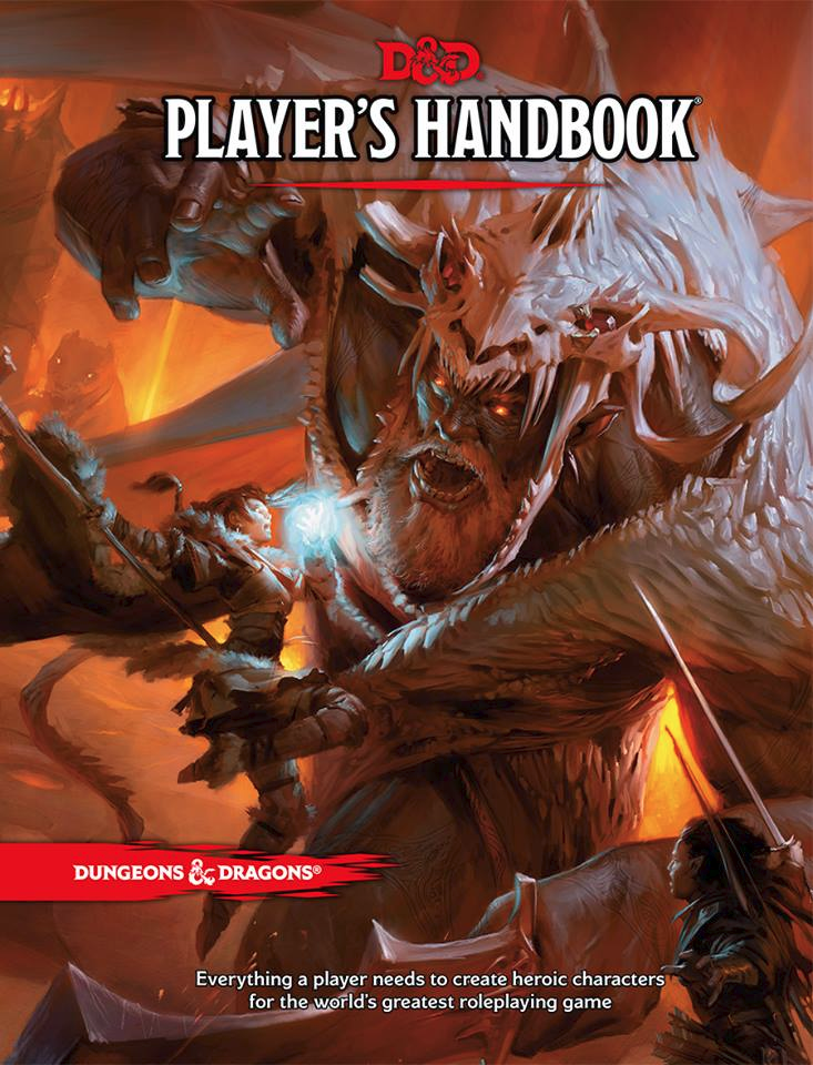 This cover, by Tyler Jacobson, is part of a trend I first noticed several years ago at GenCon when I was forced against my will to visit the dealer’s room and saw a rack with dozens of game books that were all either a vague blur of blue or a a vague blur of orange (with the occasional vague blur of brown or green thrown in). It was some Zak Snyder shit, and especially with so many books side by side together, it was just a big blur of vague color. Not a single character or monster or structure or landscape or anything stood out on any of the books. At a glance, the whole rack could have just been multiple stacks of the same handful of books. You had to take a close look to realize they were multiple titles with different art work.
A couple of weekends ago, I picked up and flipped through this book in several different stores, bought a copy, brought it home, left it on my desk in plain view for about a week, and still had no idea what was on the cover until I picked it up to start reading it. When you look closely enough to decode the cover, you’ll see that it’s an elf…magic user? who might be hovering in mid-air while she waves a glowing ball of magic energy (one of the few things that isn’t orange or brown) at a..giant or something I guess who’s lunged in some kind weird and almost certainly impractical pose (I think his hat may be a dragon). They’re in hell or something, not a dungeon. About the third time I looked at the cover, I noticed there’s also a black guy with a sword stuck down in the corner. YAY DIVERSITY! I mean, it’s probably based on insincere corporate calculation and the minority character is literally marginalized, but it’s a start I guess. There’s also some kind of worm or bug thing that’s just kind of hanging out watching from the background. What’s his deal? This cover says to me “here’s an orange blur” and does not especially invite me to open up the book with great expectations of adventure. But I guess I’ll try to do that next week anyway. [Note: The image above is considerably more distinct than the physical version of the cover. I don’t know if someone’s tinkered with the settings or if something got lost in translation somewhere in the printing process, but the digital image is a lot less one big blur.]


